

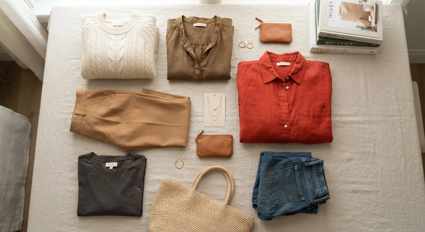
Key Takeaways
- A neutral base of two or three colours makes any outfit easier to assemble confidently.
- Tonal dressing — varying shades of one colour — is one of the most forgiving and polished approaches.
- Contrast creates visual energy; too much of it can feel chaotic, while too little reads as flat.
- Accent colours work best when they appear in small doses and connect to something already in the outfit.
- Knowing your personal undertone can help you identify which colour families tend to suit you.
What you will need
Why Colour Combinations Feel Difficult
Most adults who struggle with getting dressed aren't struggling with taste — they're working without a framework. Colour theory sounds technical, but its practical application to clothing is genuinely straightforward once you separate the useful ideas from the noise.
The real challenge is that we're often taught to think about individual pieces rather than relationships. A colour doesn't exist in isolation on your body; it exists in relationship to every other colour in the outfit, your skin tone, your hair, and the light around you. When an outfit looks 'off,' colour dissonance is frequently the culprit — even when fit and proportion are fine. See our guide to why outfits disappoint for a broader diagnostic.
This guide focuses on practical combinations: neutrals, tonal approaches, contrast ratios, and accent colours. It won't require you to memorise a colour wheel, though having one nearby can occasionally be useful.
What you will need
The Four Approaches — and How to Use Them
There are four reliable strategies for building colour combinations that hold together. Most people naturally gravitate toward one or two; understanding all four gives you the flexibility to dress confidently across different contexts.
1. Neutral-Led Dressing
A neutral is any colour with low saturation that pairs easily with most other hues: black, white, grey, ivory, navy, camel, tan, and warm or cool browns. Building the majority of your wardrobe in two or three compatible neutrals creates an almost automatic foundation — pieces mix and match without conscious effort.
The key nuance is that neutrals have undertones. Black can lean cool (blue-black) or warm (brown-black); white can be crisp or creamy. Mixing neutrals with clashing undertones — say, a cool-grey top with warm-beige trousers — often produces the subtle wrongness people can't quite name. This is worth checking if your basics feel inconsistent together.
2. Tonal Dressing
Tonal dressing means staying within one colour family and varying the depth of shade — light blue with mid blue, or ivory with camel with tan. It's one of the most forgiving approaches available because the hue harmony is built in. The risk is monotony; textural variation (linen versus cotton versus knit) and slight tonal contrast keep it visually interesting.
3. Contrast-Based Combinations
Contrast is the degree of difference between two colours' lightness or hue. High contrast — black and white, navy and cream — creates strong visual impact. Lower contrast — charcoal with mid grey — is softer and more relaxed. Neither is inherently better; the choice depends on the context and the impression you want to make. Proportion interacts closely with contrast: high-contrast colour breaks draw the eye to where colours meet, which affects how volume and structure read.
4. Accent Colour
An accent colour is a single intentional departure from your base — a rust belt against a beige outfit, a cobalt bag with a grey ensemble. Accents work best when they're isolated (one piece, not three), when they echo something already present in the outfit (the warm undertone in a neutral, for instance), and when they don't compete with each other. One accent at a time is a reliable rule of thumb.
Colour Rules Are Starting Points, Not Laws
Every framework in colour theory describes tendencies, not absolutes. Cultural context, personal preference, skin tone, and occasion all shift what 'works.' Treat these principles as a vocabulary for understanding what you're seeing — not a rulebook that overrides your own eye.
Step-by-Step: Building a Working Combination
The steps below walk you through assembling a colour-coordinated outfit from scratch. The same logic applies whether you're building a single look or rethinking your broader wardrobe approach. If you're starting with very little, our guide to building a wardrobe from scratch covers the full foundation.
Identify your neutral base
Choose two or three neutrals that you already own and feel comfortable in — or that you're willing to build toward. Check that they share a similar undertone (all cool, or all warm) so they work together naturally.
Examples of compatible cool neutral sets: white + grey + navy. Compatible warm neutral sets: ivory + camel + tan.
Choose your approach for this outfit
Decide which of the four strategies fits your context: neutral-led (for versatility and ease), tonal (for a polished, pulled-together look), contrast-based (for visual impact), or accent-led (for a single intentional pop of colour).
For everyday dressing, neutral-led or tonal combinations require the least deliberate effort once your base is established.
Assemble your base pieces
Start with the two main garments — typically top and bottom, or a single-piece garment. If using neutrals or a tonal approach, confirm that the undertones are consistent. If using contrast, verify that the contrast ratio is intentional and even (light against dark, not medium against medium).
Add a single accent or layering piece
If the base combination feels complete, leave it. If it needs interest, add one accent — a third layer, a belt, a scarf — in a colour that responds to something already in the outfit. An accent that echoes the warm tone in a neutral, or picks up a secondary colour in a pattern, will read as deliberate rather than random.
Evaluate accessories as part of the colour story
Shoes, bags, and jewellery carry colour. Step back and assess the full outfit — including accessories — as a single composition. If a shoe colour introduces a third distinct hue that competes with the accent, consider switching to a neutral alternative.
Check in natural light before leaving
Take a final look in natural or daylight-equivalent light. Undertone clashes, colour cast differences, and low-contrast near-matches are all more visible in daylight than under warm artificial lighting. If something looks slightly off but you can't identify why, check whether the undertones of your pieces are consistent.
Test Combinations in Natural Light
Artificial lighting — especially warm indoor bulbs — can disguise undertone clashes between pieces that are obvious in daylight. Before committing to a new colour pairing, check it near a window. What looks like a harmonious navy-and-black combination indoors may read as a muddy mismatch outside.
Common Mistakes and How to Avoid Them
Even with a clear framework, a few persistent errors tend to derail colour combinations.
- Too many focal points: When every piece in an outfit is a different colour or print, the eye has nowhere to rest. Reduce competition by grounding the look in at least one neutral piece.
- Ignoring undertone consistency: Cool and warm versions of the same colour family can clash visibly. If a combination looks off but you can't say why, check whether your pieces share a warm or cool undertone.
- Treating black as a universal neutral: Black is a powerful neutral, but it doesn't play equally well with all colours — particularly very warm ones, where it can feel jarring. Navy or charcoal are often softer alternatives.
- Overlooking shoes and bags: Accessories carry colour too. A pair of shoes in a third distinct colour can fragment an otherwise cohesive outfit. Including accessories in your colour thinking — rather than adding them last — prevents this.
Avoid Building Around a Single Trend Colour
Trend colours cycle out quickly, and a wardrobe built around a single seasonal hue can feel dated within a year. Use trend colours as accents against a stable neutral foundation rather than as the organizing principle of your closet.
For a broader look at the style decisions that shape how an outfit reads overall, understanding classic versus trendy approaches is worth exploring alongside colour fundamentals. And if you want to extend this thinking into how your wardrobe is organised, our complete wardrobe organisation guide connects colour strategy to practical storage and editing.